Project TomTom Digital Cockpit
Role Senior Product Designer
Year 2022 - 2024
Company TomTom
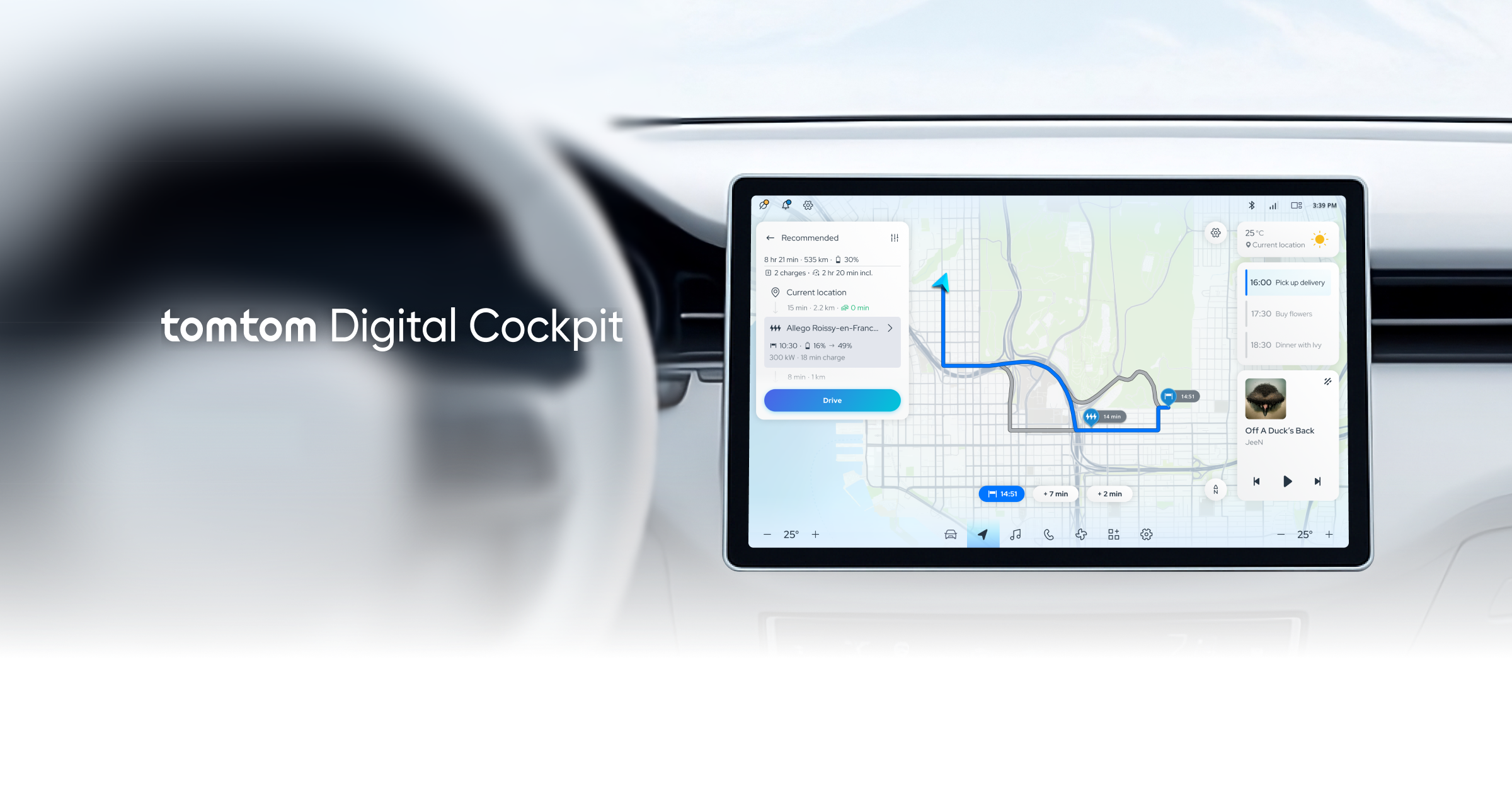
TomTom Digital Cockpit is a scalable in-vehicle infotainment system to help automotive makers build a highly customised IVI system with the least possible resources. As a senior UX designer, I was responsible for the end-to-end user experience design, creating for use cases based on very different driver types and client requirements, and conducting cross functional collaboration.
User Driver needs

User Research
UX needs vary greatly by vehicle type. In order to ensure our design decisions were grounded in real user needs, we collaborated with our research team to understand the needs of drivers, which provided context-specific pain points and expectations from them. For example, we found that electric vehicle drivers have anxiety of battery and charger availability, while long-haul truckers wanted ability to plan routes including rest stops, and cargo monitoring.
Scenario design
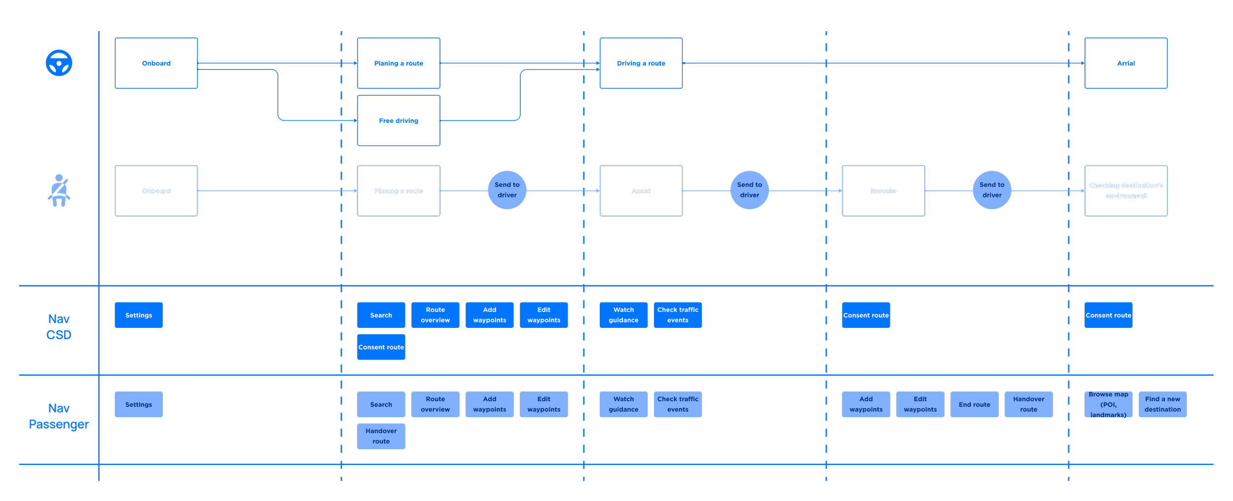
To articulate user intent, friction points, and opportunities, we defined vehicle-specific user journeys — for example, consumer vehicles focused more on navigation, media and personalisation. Then we plotted user journeys in various scenarios — commute, drive-out-of-town, deviate, and so on. We also designed usage scenarios around edge cases like poor network reception, low battery, active handover from driver to co-driver, etc., to consider the experience as safe and seamless for users across a range of situations.
Driver testing
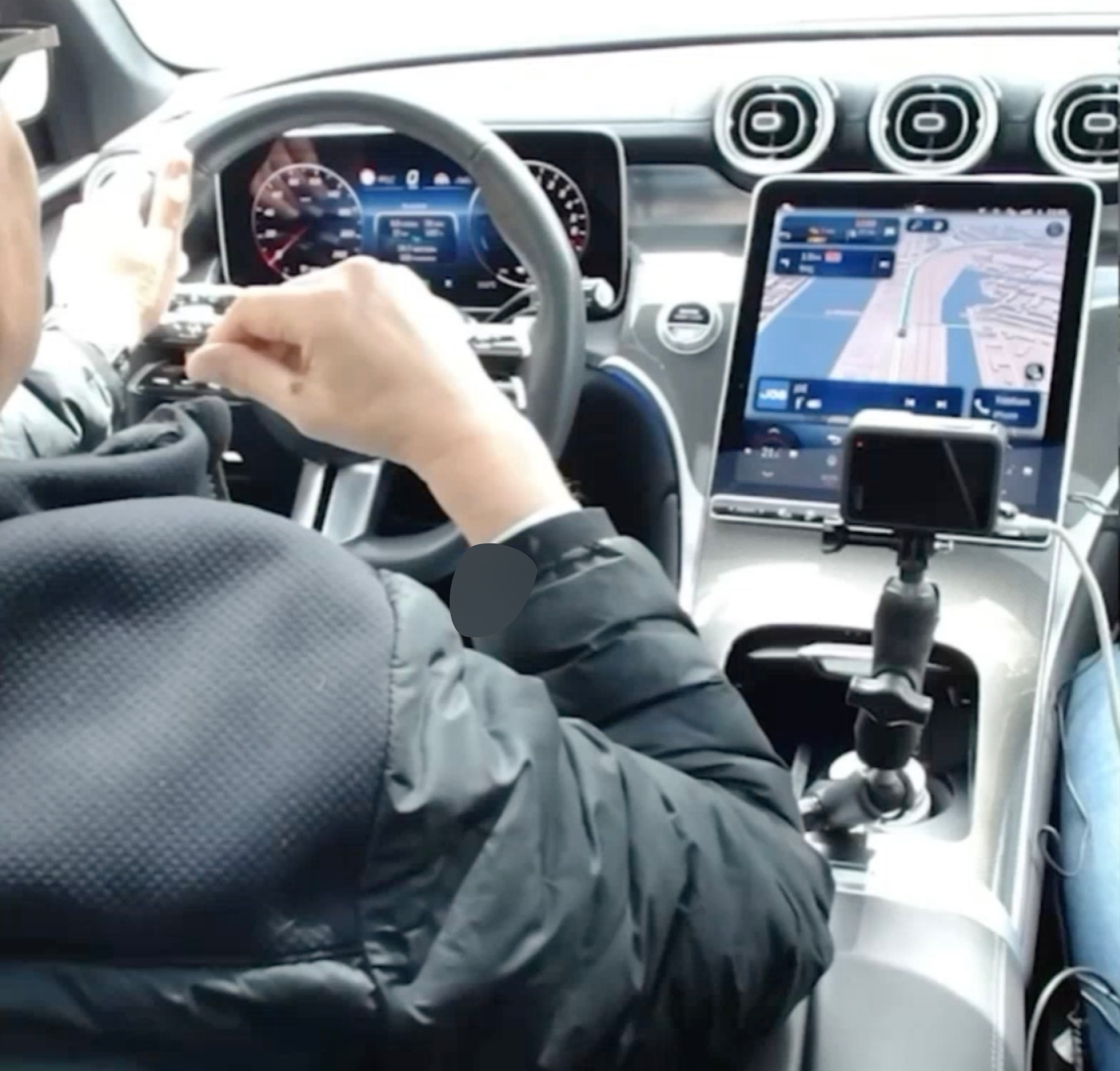
We executed multiple usability tests, both in-car usability tests, and test drives, to verify that our designs performed well under typical driving conditions. In response to feedback received, we iterated interaction patterns and polished UX to increase the usability of the product.
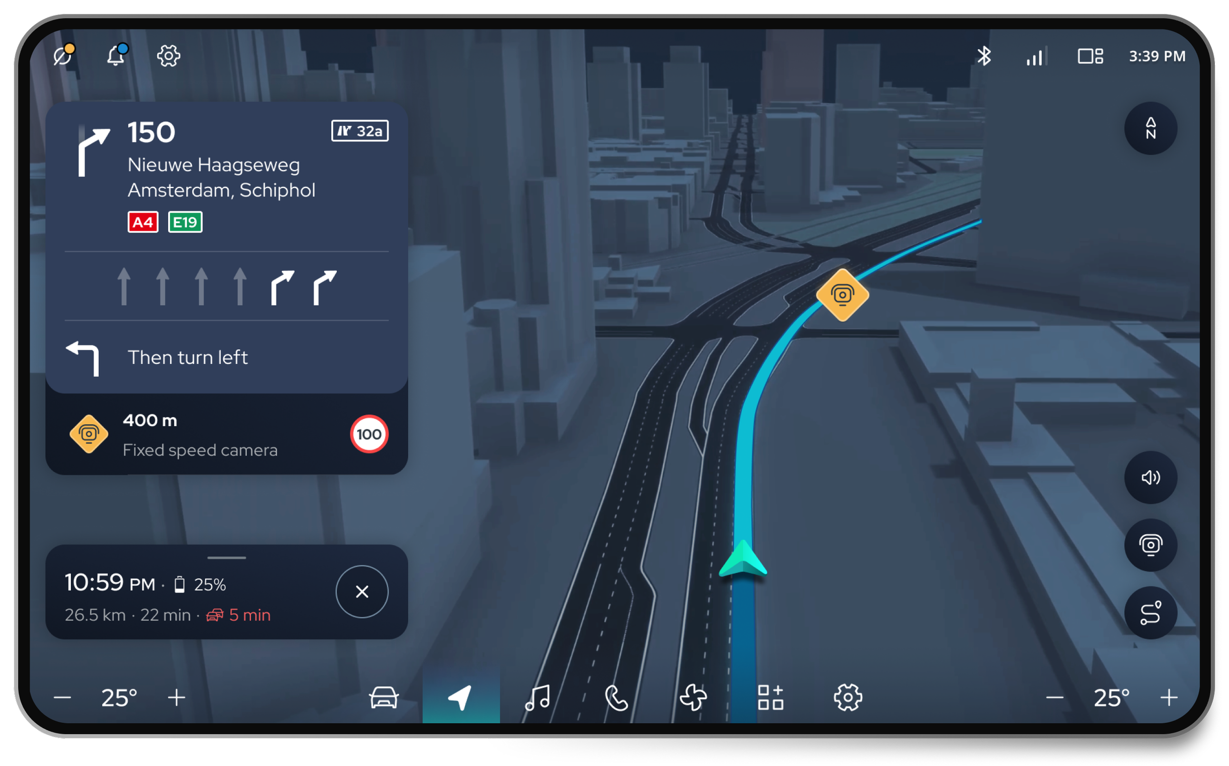
Designing for safety
Safety was the top priority. We optimised the placement, sizing, and spacing of components to ensure usability during drive. We ensured key information (such as navigation or driving conditions) was located in the areas where were easiest for drivers to reach and glance at. To achieve this, we had to We also eliminated all unnecessary UI elements to reduce the on-screen clutter and only show what was necessary in each context to allow drivers to complete key actions with minimal interruption to their view of the road.
Focused interaction

We designed every screen and every flow for the user's driving context; i.e. parked, in traffic, or on the highway. We eliminated unnecessary elements to reduce steps and cognitive load in each context to allow drivers to complete key actions with minimal interruption to their view of the road.
Cluster & centre display
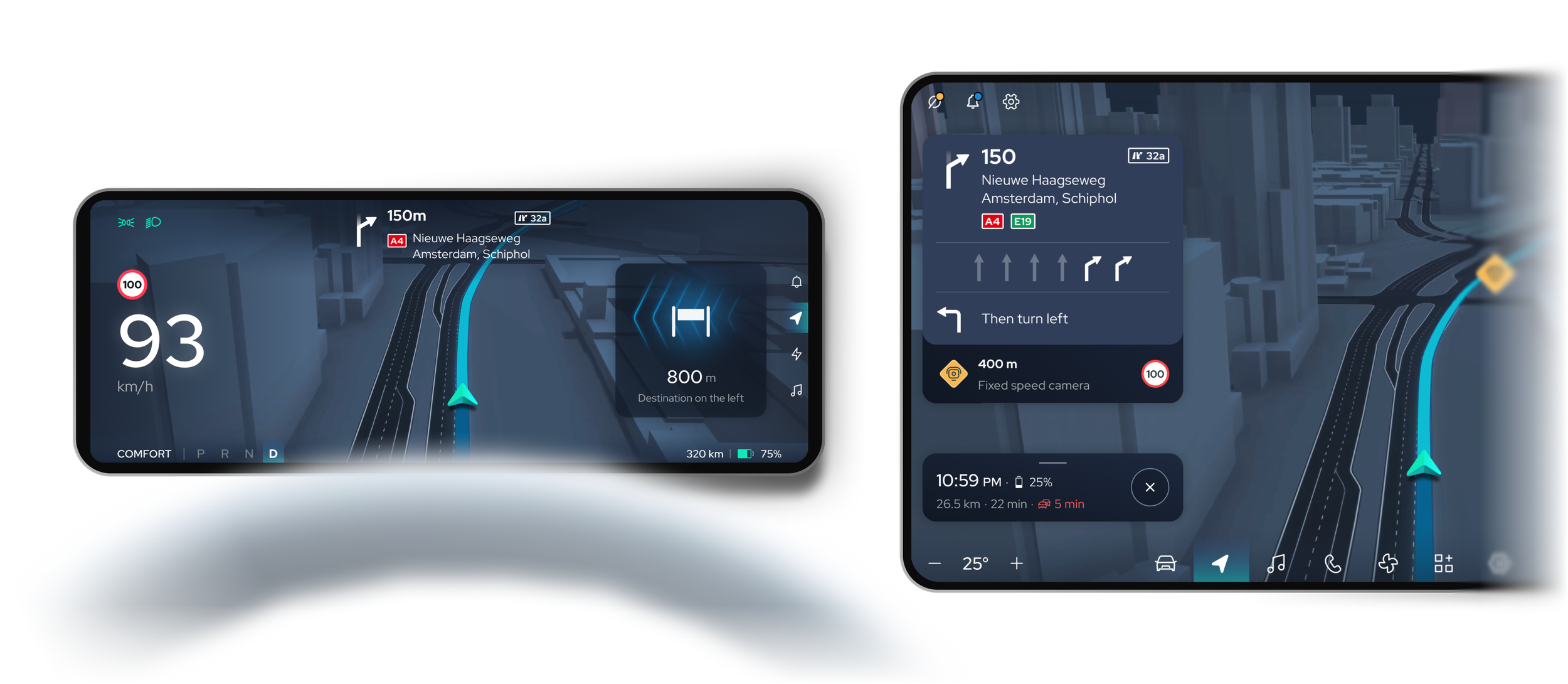
We distributed content between the cluster and centre display. Important information that requires priorities (such as speed, navigation prompts, alerts, etc.) was represented in the cluster. Information that is more informational or interactive (i.e. media, vehicle settings) was represented in the centre display, which made it less likely to distract the driver and assists in helping the driver focus on the road.


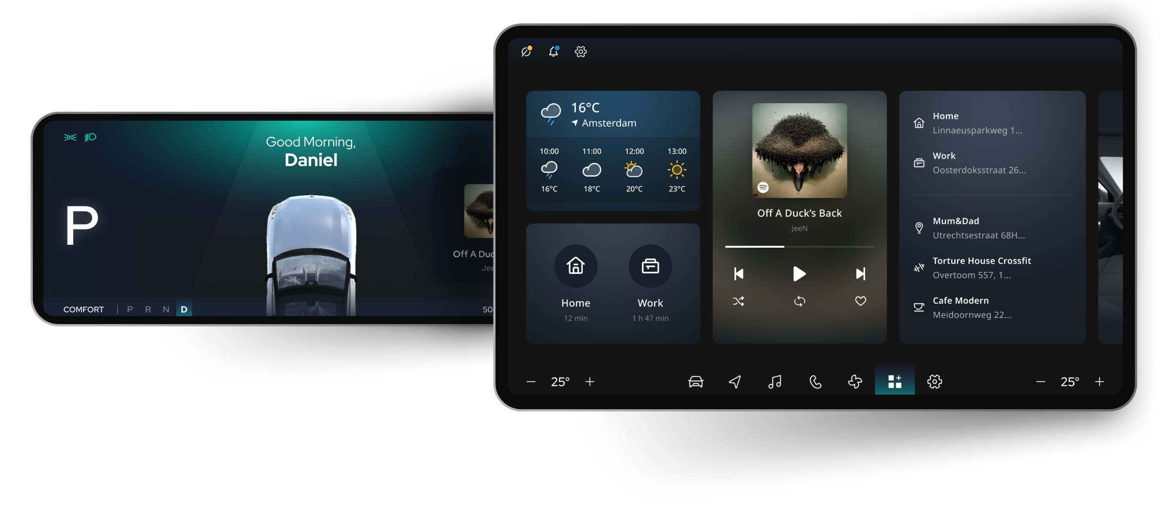
Light mode & dark mode
Sudden brightness changes can momentarily impair drivers—especially at night or in tunnels. We implemented adaptive light/dark modes that automatically respond to ambient conditions. This design choice balanced visibility and comfort, keeping the interface readable while reducing visual strain in varying lighting environments.
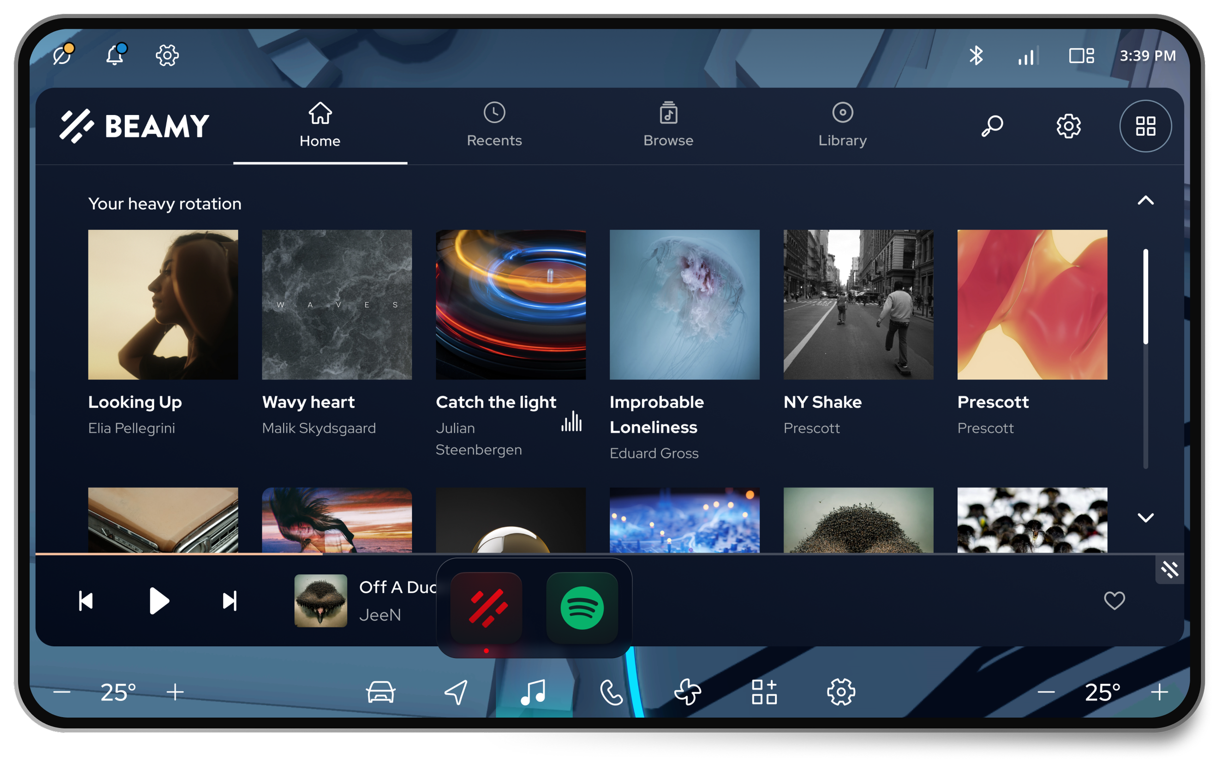
Customisation & scalability
Every automotive B2B client wants to customise their IVI experience in terms of interface architecture and visual styling. We developed modular UX frameworks and componentised UI so that our clients can build products with deep customisation, while being scalable.
Design system & structure
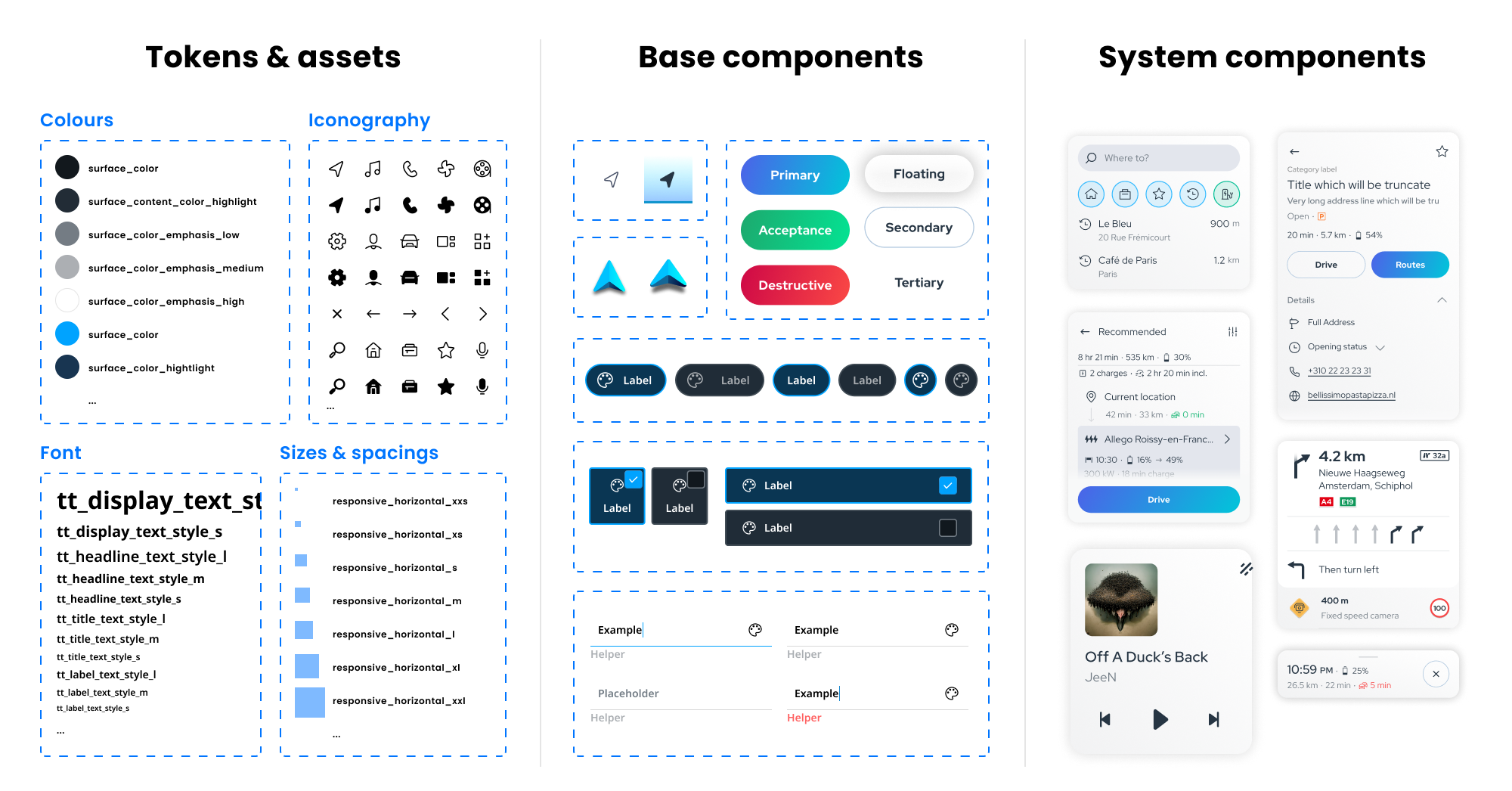
One of the primary successes on this project was to create a scalable design system and technical structure that allowed for deep brand customisation whilst maintaining consistency. This system established the basis for reusable components and design templates to progress development speed amongst client implementations. It contained colour tokens, iconography, motion principles, guidelines for safety, and more.
Responsiveness

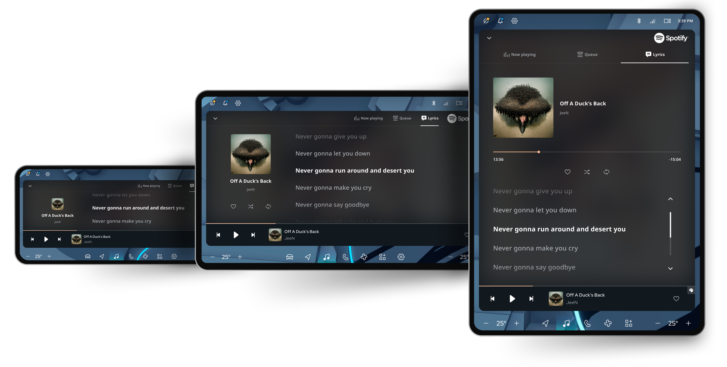
We designed the UI to adapt to any screen size or aspect ratio, enabling clients to easily apply their layouts to their own display hardware. This flexibility ensures consistent usability and visual quality across diverse vehicle setups.
3D integration

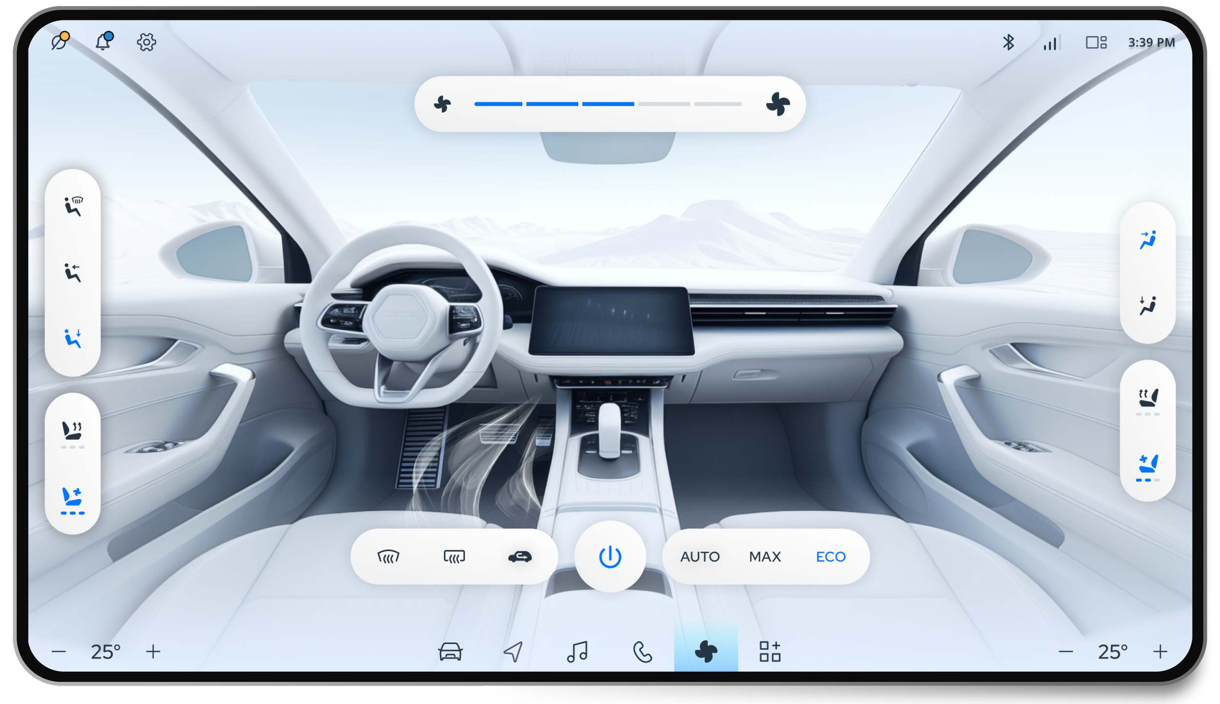
To achieve a high-end and unique appearance, we developed a flexible UI layer that can accommodate 3D engines like Unity. This enabled dynamic visuals, such as animated HVAC controls and an interactive 3D vehicle model that reflects the real-time status. This UI layer provides clients with the ability to provide branded immersive IVI experiences that extend well beyond basic flat UI design.
