Project BlendVision visual concept
Role Design Lead
Year 2021
I led and executed this project focusing on shaping the visual concept of BlendVision with the product team. In summary, we set out to create a brand and user experience that would simplify the streaming experience every day, with a user experience narrative built around the clarity of content and simplicity.
Rebranding: a new start
In the course of a rebranding process, numerous products came together as a singular brand called BlendVision. These products had long supported users in their daily work and the objective was to bring them all together under one identity as a single experience. BlendVision was built as a smarter, simpler streaming tool that allows the users to focus on what is most important. Clarity, simplicity and functionality informed the design direction, so we tried to reflect this in a visual concept that supports these values, to ensure the user feels the interface is clean, unintrusive, and always in service of their tasks.

Task-focused
The interface should allow attention to only content relevant to the current task and keep other elements out of the workspace.
Content-focused
Menus and controls are only supportive to the content as the center of the user work without visual interference.
Conception
We started discussing and exploring inspiration from everyday life objects, looking for connections between the physical environment and the digital workspace. Doing this anchored our ideas in tangible experiences that people consider intuitive.

A clean workspace
One idea stood out, inspired the working desk: in real life, everything we need is neatly organised and within arm's reach at our working desk. We took that and wanted to bring this experience into the UI: a simple, clean, minimal interface that has no unnecessary decoration, so users will find what they need in that moment.
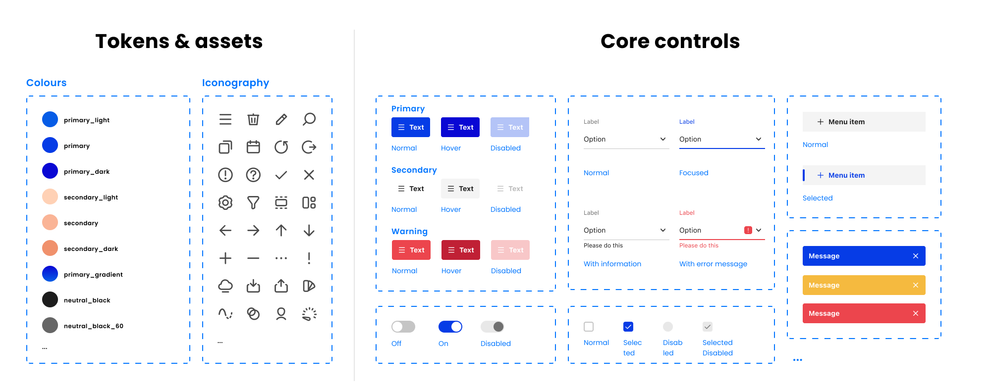
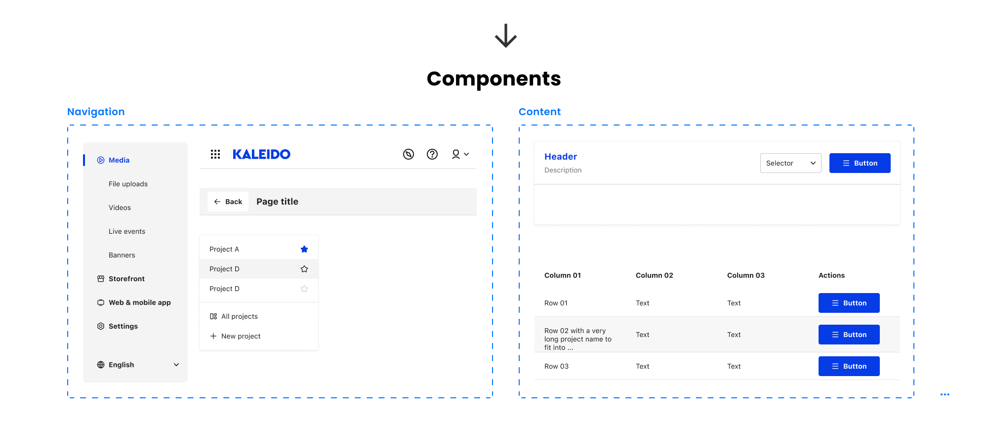
Building a design system
To back up the visual direction we built a flexible design system consisting of:
A limited color palette that enhances visibility of content.
A clear visual hierarchy to facilitate attention without clutter.
A modular approach that allows the interface to adapt based on different use cases.
A friendly personality across copy, iconography, and animation for a cozy and approachable workspace.
Altogether these components developed a system that supports not only consistency and scalability, but also a clean, easy-to-use interface. A design system that supports a workspace where you can concentrate and be engaged on your content without distraction with everyday tasks.
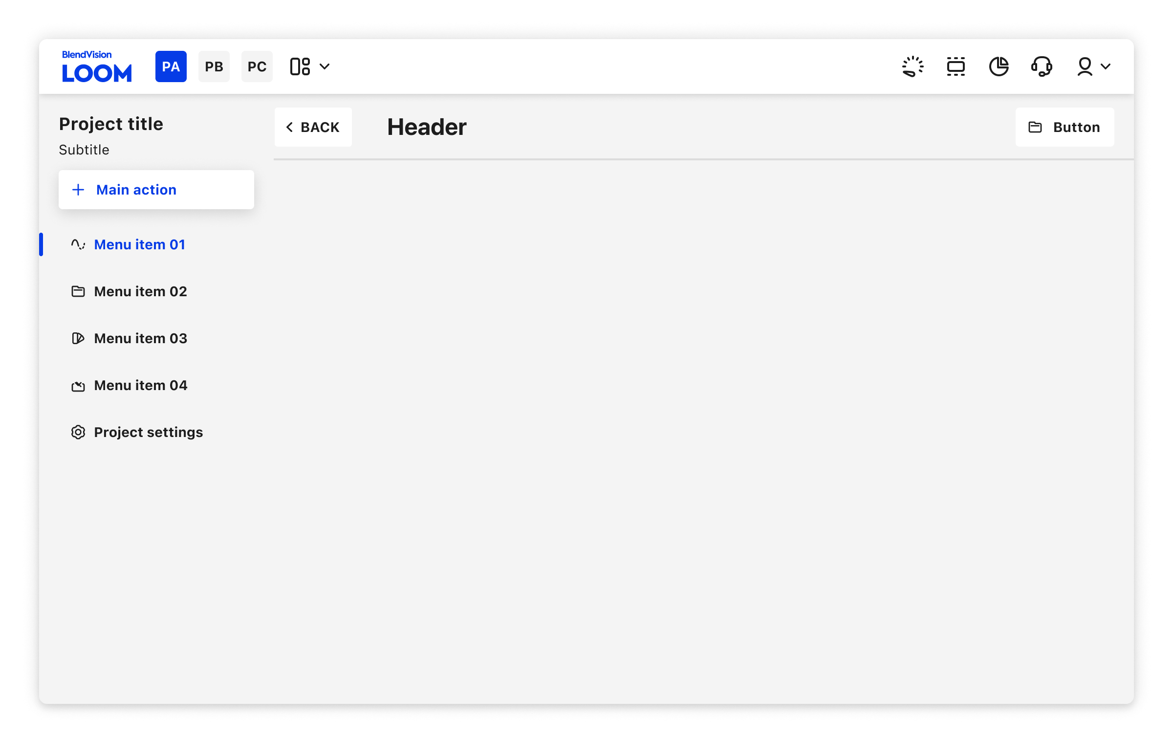
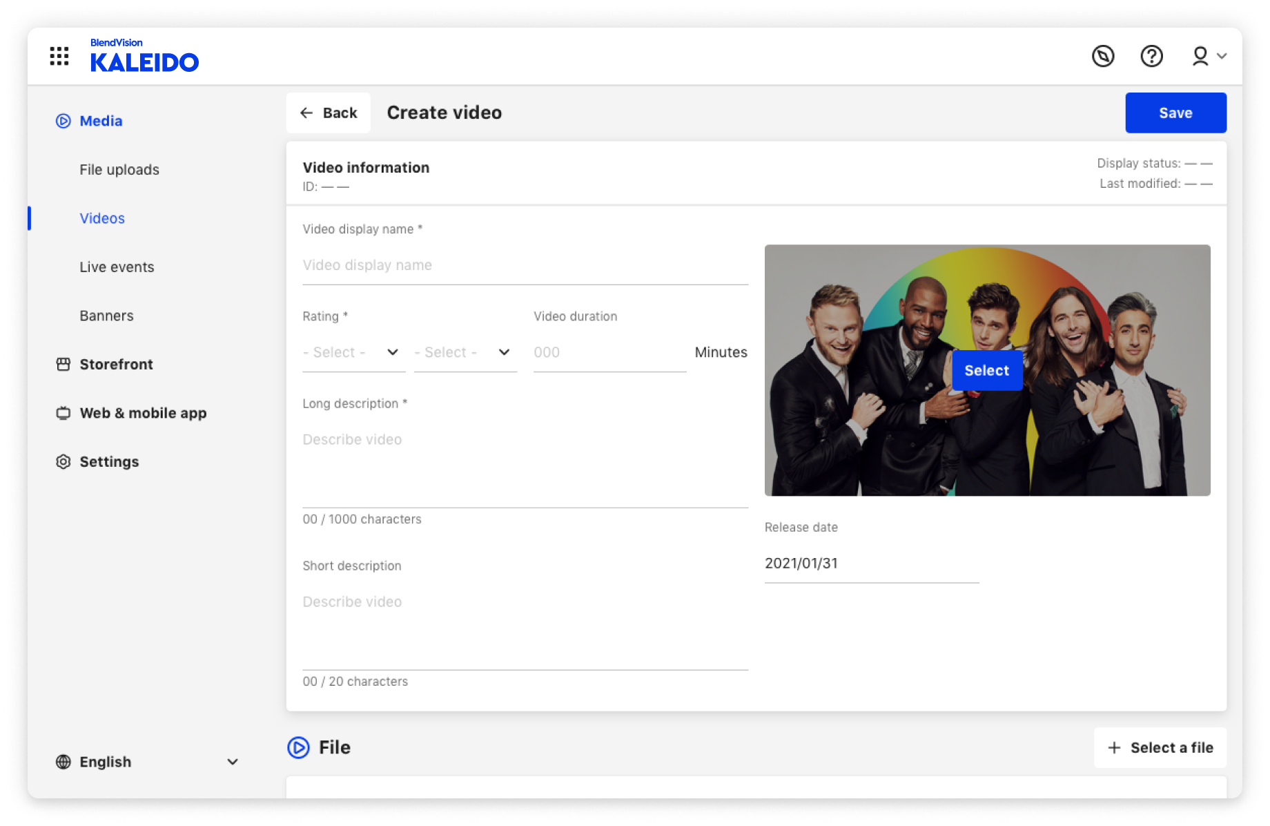
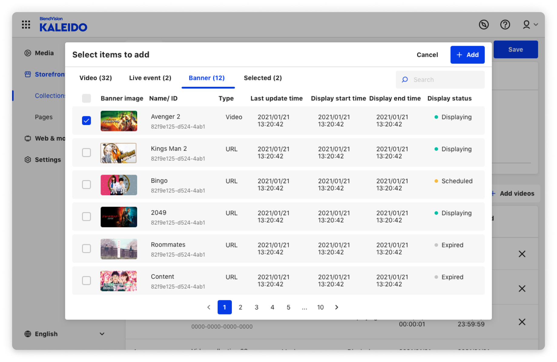
Design screens
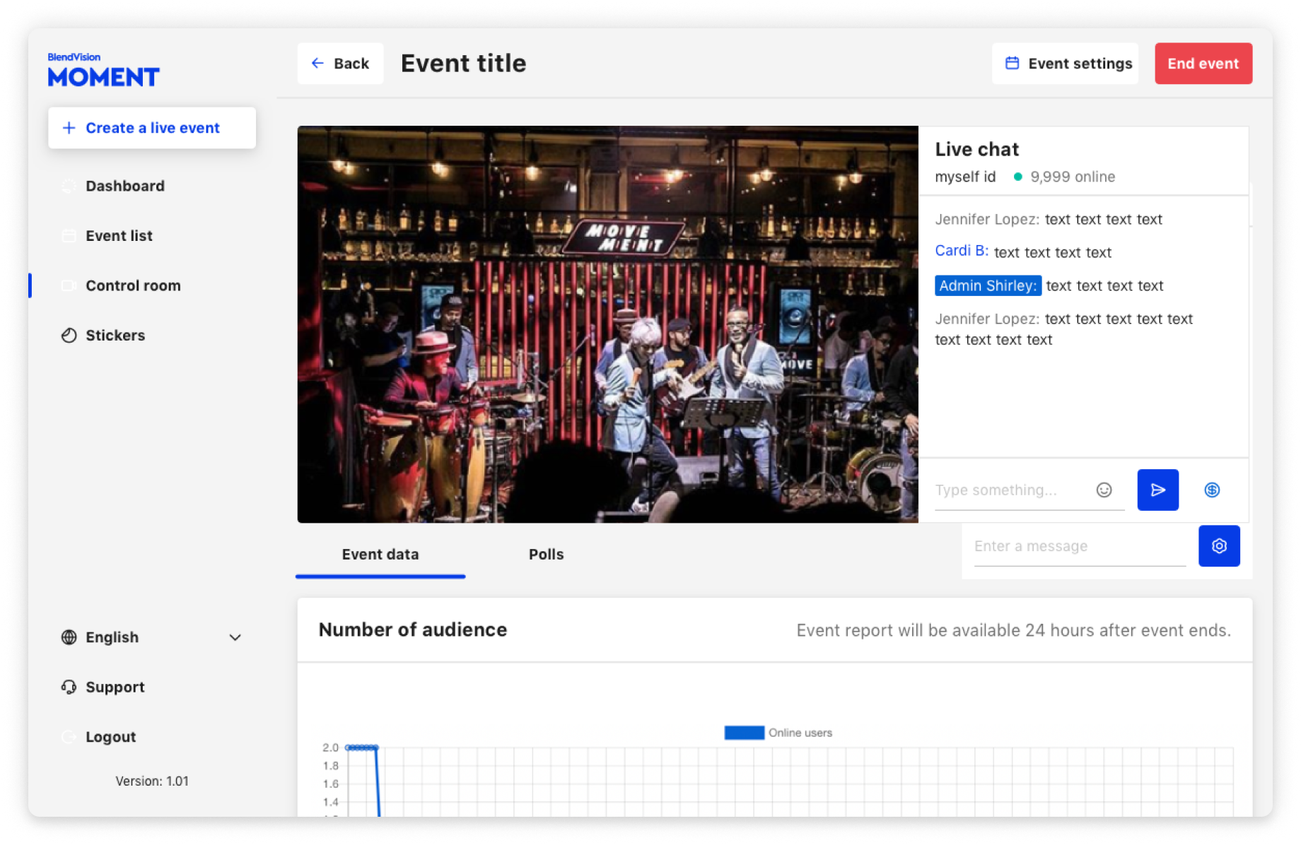
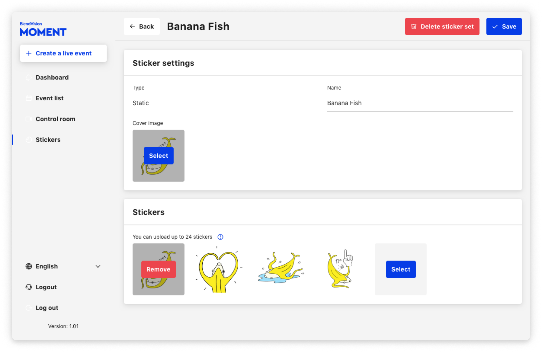
The design connects the concept and system together. Drawing upon the concept of a physical desk, the interface focuses on the user’s tasks and content and removes distractors, reminiscent of a clean, orderly workspace. The design system then allows for this focus to be both consistent, and scalable, across products and contexts, providing flexibility to the UI while maintaining a unified experience.
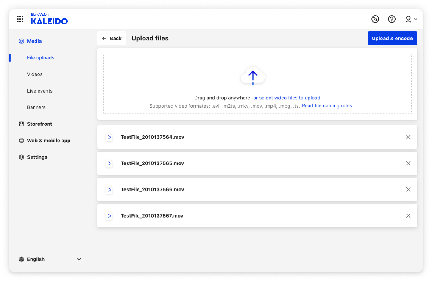
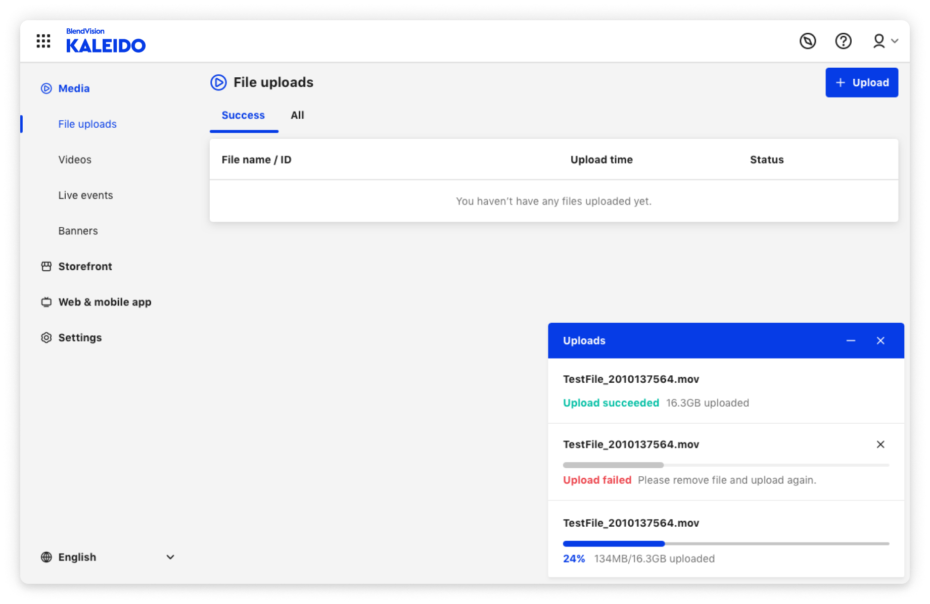
BlendVision Kaleido
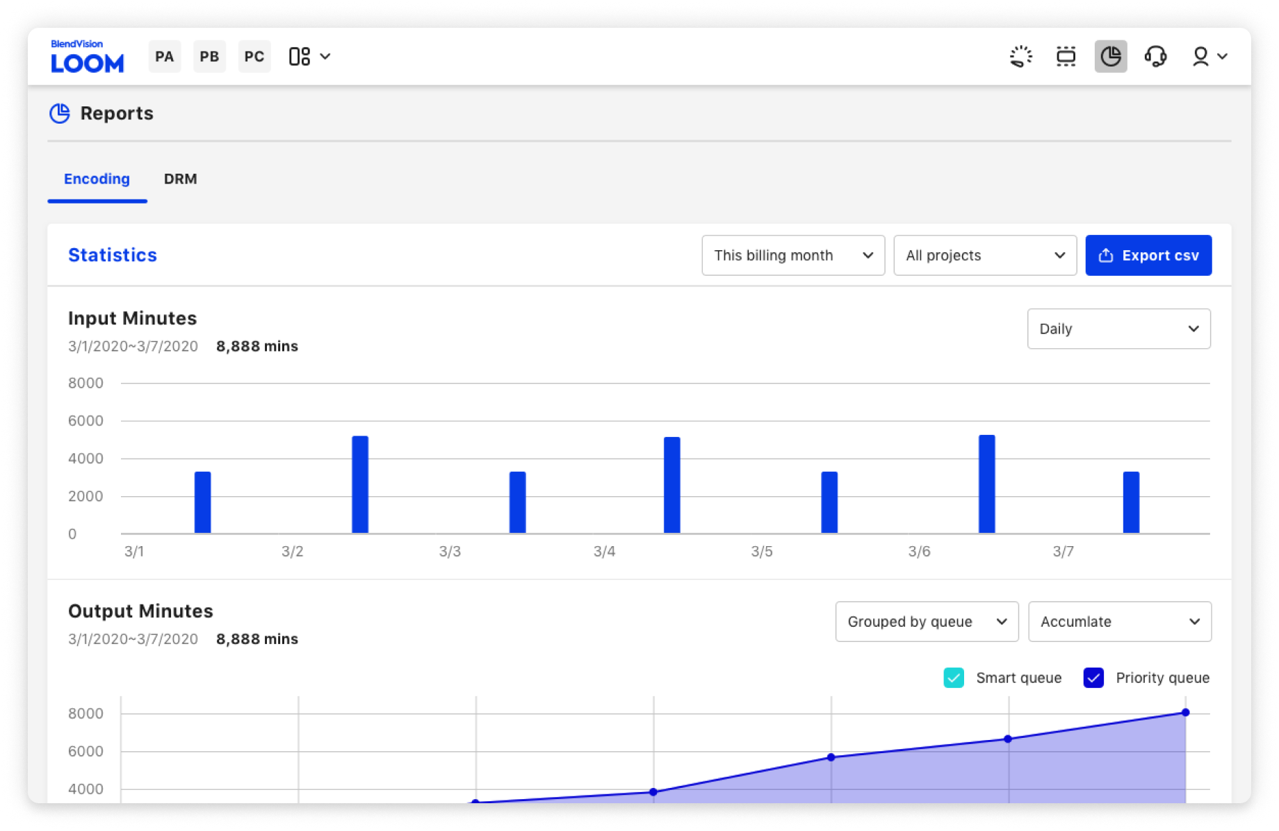
BlendVision Loom

BlendVision Moment