
Project Settings copy improvement
Role UX Designer (Lead)
Year 2025
Team Product design, collaboration with UX research
Tools Clickable high-fidelity prototype, remote testing platform
I led the project to improve the Settings Panel copy in a navigation product, guiding the process from initial planning through to implementation. This included defining the research approach, conducting user testing, analysing feedback, and iterating on the copy. By driving the project end-to-end, I ensured that the final outcome not only resolved clarity issues but also established a more consistent and user-friendly tone across the Settings experience.
Background
Collected feedback from previous research sessions indicated that some terminology used in the Settings Panel were unclear, or interpreted differently than intended. This created uncertainty in decision making, and affected users' confidence and trust in the product. Therefore we needed to conduct researches focused on the copy to improve clarity, consistency, and alignments with users' expectations.
Goals

Clarity
Identify settings items where copy caused confusion and improve them for better clarity.

Consistency
Ensure consistency of tone and language across the entire Settings section.
Challenges
Complex functions
Certain settings required explaining advanced or technical functions.
Jargons
Some professional or industry-specific terms were necessary but were not easily understood by everyday users.
Length of wording
Copy needed to be concise enough for quick scanning while still conveying accurate meaning.
Research & user-testing
We used a cognitive walkthrough approach to evaluate how users understand the copy in the Settings Panel. We recruited participants who are:
Native English speakers (from the US or the UK)
EV drivers, drive at least once per week
Use navigation guidance during driving more than half of the time
Cognitive walkthrough
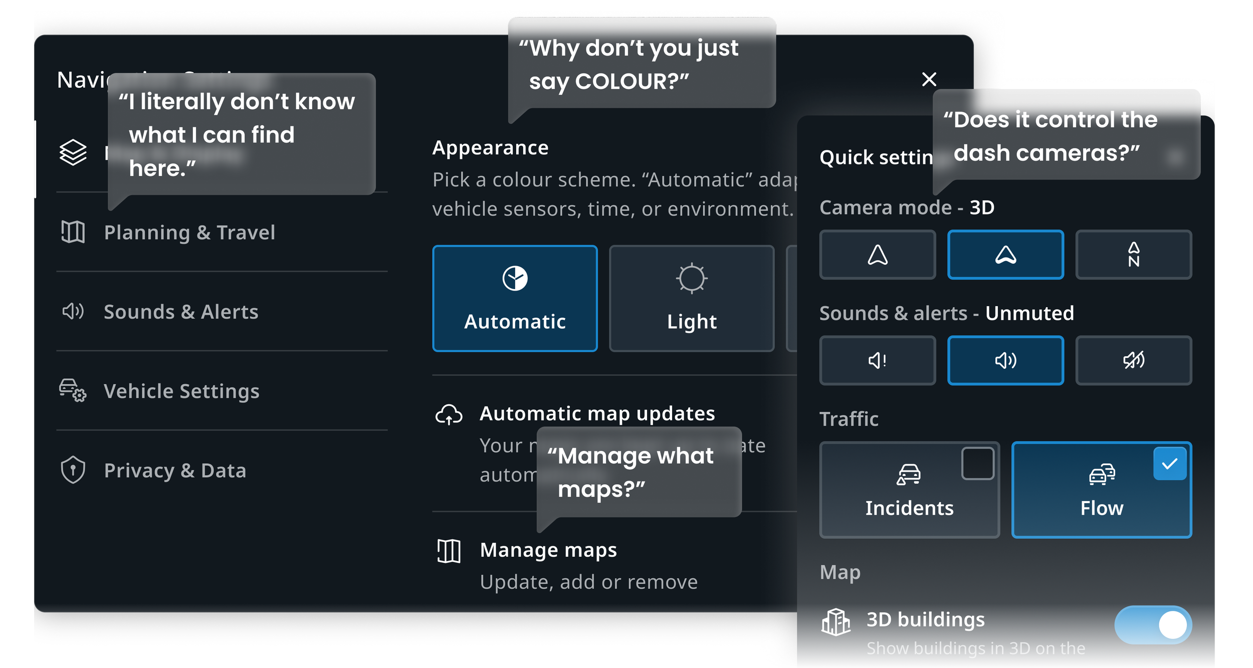
We conducted cognitive walkthrough testing. Participants interacted with a clickable prototype of the Settings Panel.
They were asked to read each item and vocalised what each item meant, which helped us document their immediate interpretations.
Iteration & re-test
We recorded instances of confusion, mismatch, or hesitation.
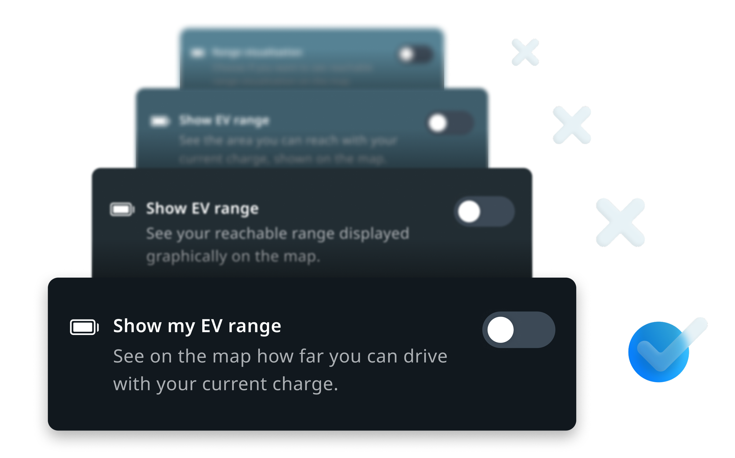
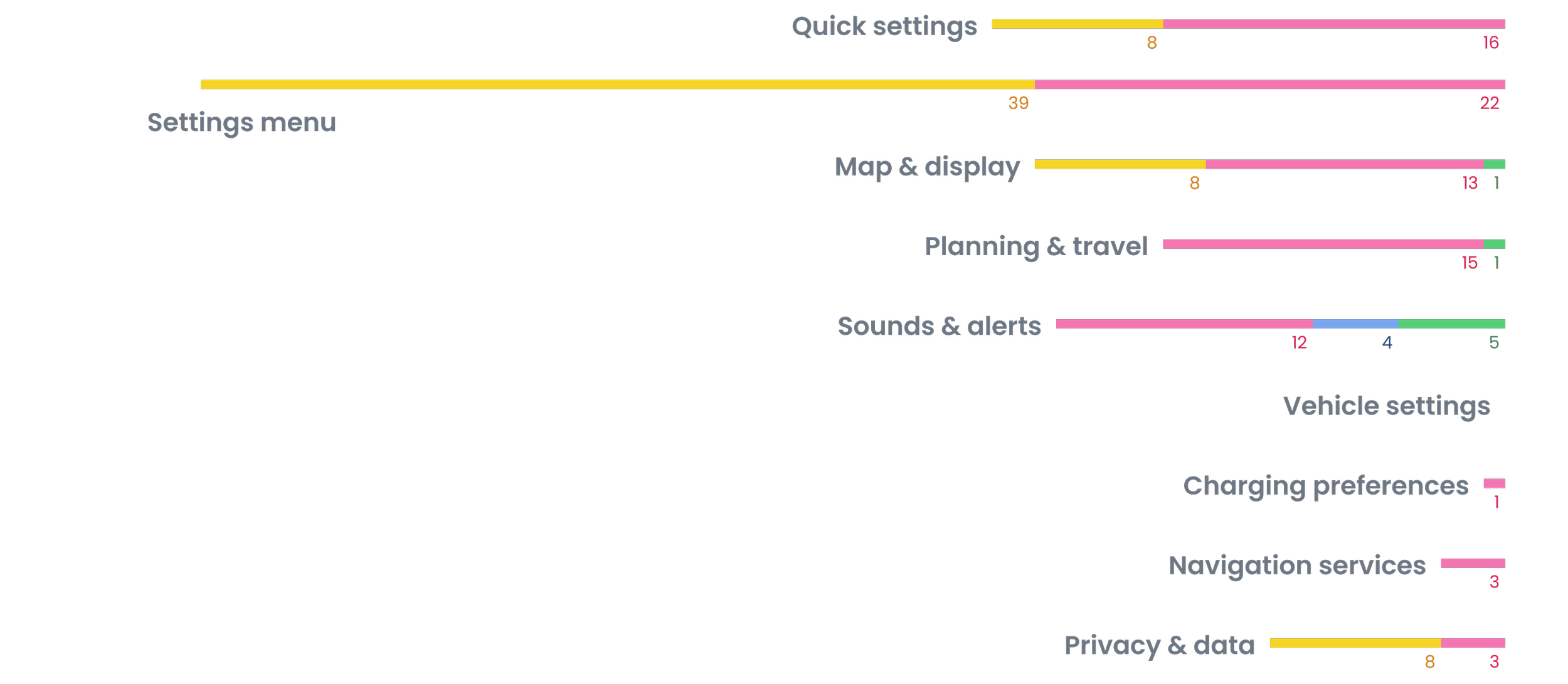
After the first round of cognitive walkthrough testing, we edited items that were problematic based on participants' comments and tested the revisions in another round of user testing.
Analysis & findings
We observed user responses and organised the findings into four overarching themes:
Mismatch between intent and interpretation
Users read them differently than intended.
Unclear wording
Vague or technical text that users aren’t sure what it could mean.
"I'm not sure..."
"I don't know..."
Unnatural tone
The copy sounds stiff, overly formal, or like it was written by a machine.
"I feel like a better way..."
"I would call it..."
Too much text
Long or crowded text that makes users skim or skip.
"Too wordy..."
"It's not necessary..."
Results & learnings
A few rounds of testing and iteration resulted in notable advancement in user understanding and interaction with the Settings Panel.

76% improvement
Reduced problematic strings in the copy from 30 to 7 items.

Better clarity
Users expressed increased confidence in understanding and adjusting settings.

Consistent writing
The new copy was more natural and consistent, across the whole system.
This project highlighted the critical role of language in shaping user confidence and usability. Beyond fixing individual issues, it reinforced broader lessons about how copy impacts trust and how testing methods influence outcomes.
Subtle differences in wording can have major implications on trust and usability.
Consistent tone across a product empowers users and build trust.
Testing copy in context (using clickable prototypes) is most effective.
