Product Citiesocial shopping app
Year 2016 - 2018
Presented by Citiecoial Ltd.
Citiesocial is a shopping app that features classic, clean, and user-centred experience. We used different methods to gather insights from our users to improve their online-offline shopping experience.
Data-driven design
At citiesocial, every decision has to be based on data. Therefore designers and managers all had to mine data from analytics platforms like Google Analytics. We didn’t only ready the simple number of an item, but dug into each user flow to understand when and why the user made this route.

Analytics
When we start a project, we would use analytics first; and when we review a project’s results, we would also rely on them. They are the most direct tool to help us understand our users and push us to build more coherent features.

Define scenarios
We also dug into different scenarios. For example, if we only see the drop-off rate from a product’s detail page, it means nothing; but if we cross-analyse it with the users’ sources we can find some insights with those users from EDM and those from the home page.
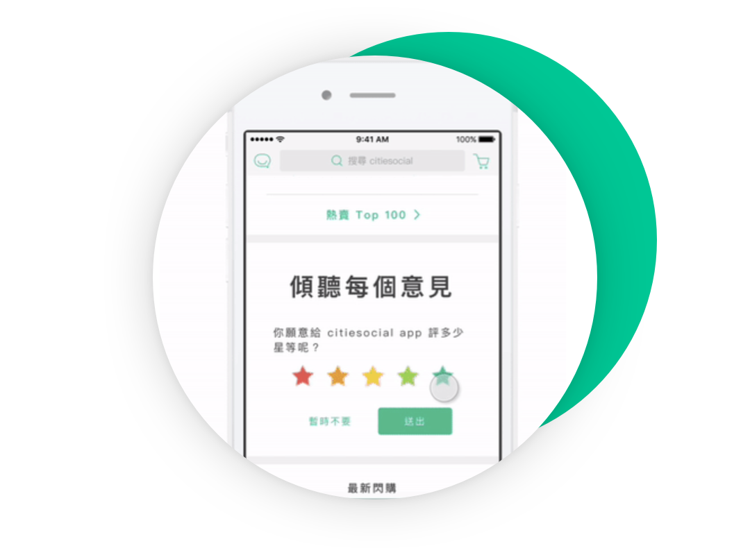
First-hand feedback
While data is neutral and reliable, it can build a barrier between us and the users. To help us understand their needs, we interviewed our users to collect their opinions and seek improvement from both the users and citiesocial.
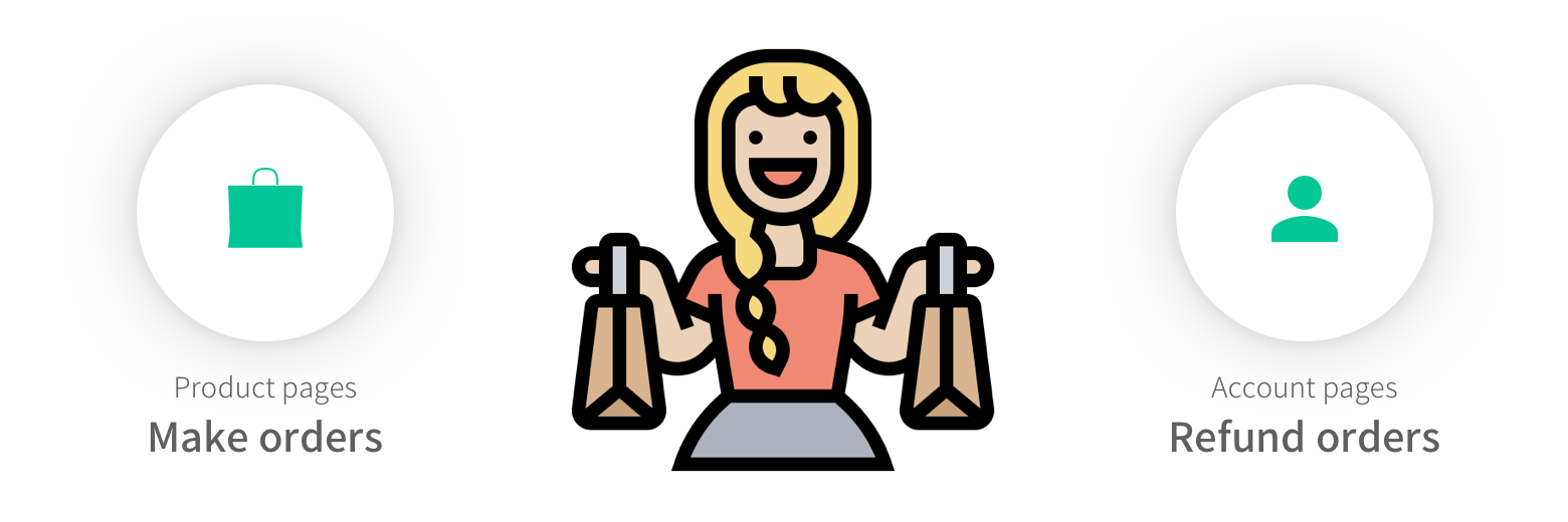
Reshaping shopping experience
Taking the example of refunding an order — this is the most crucial phase to show your brand’s ability to build trust, handle friction with empathy, and turn a potentially negative moment into a positive experience. A well-designed refund flow reassures users, reduces frustration, and reinforces the reliability of the entire shopping journey.
Finding Chance point
When we were researching the page click rates, we found that a lot of users directly went to the order list. After we analysed the user flows, we realised one important thing — customers who shop online refund their orders quite a lot. If you want them to shop fast, you need to allow them to refund fast.
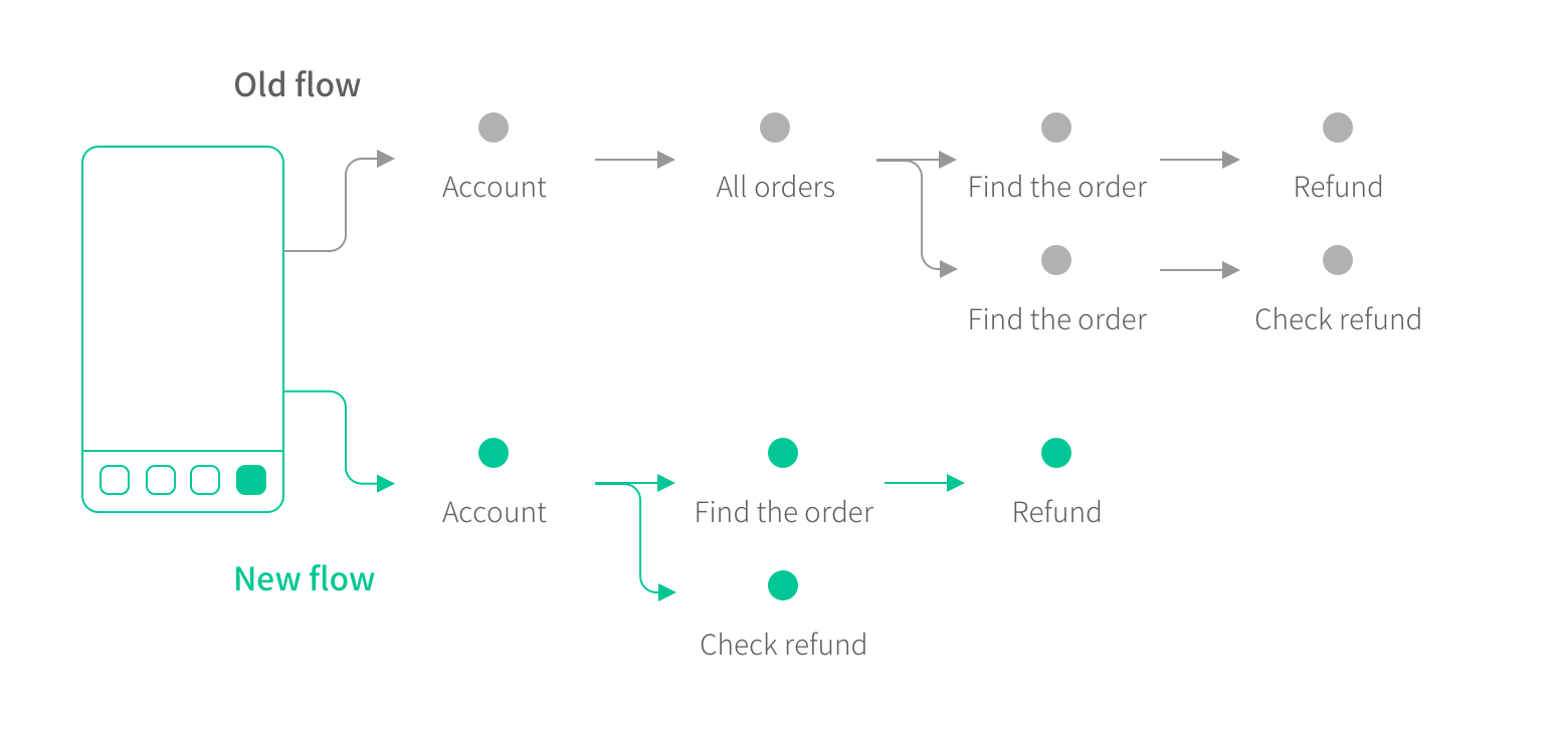
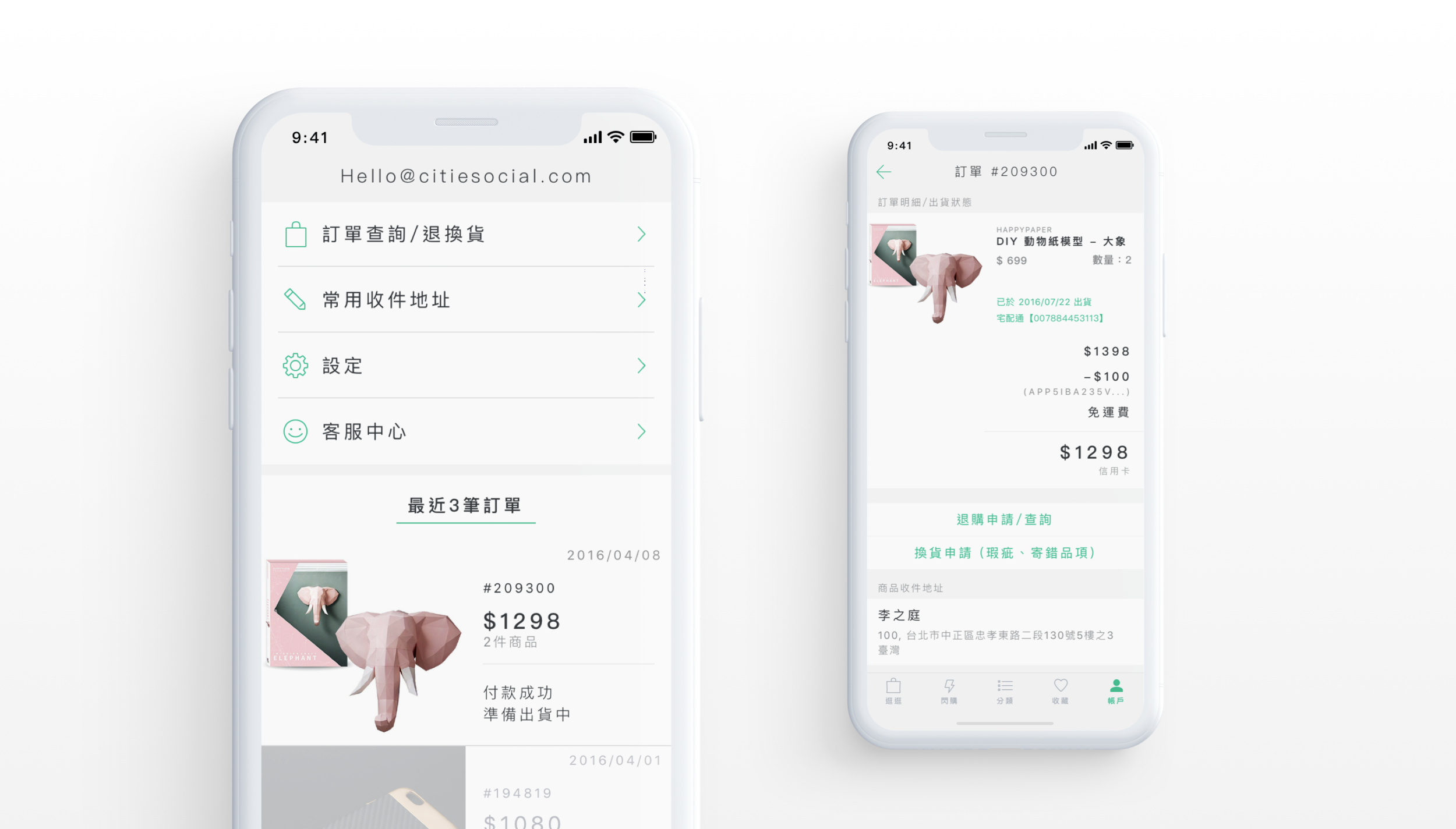
Recreating Flow
There was no way to avoid refunds — if a customer wants to refund the product, they would try everything. Instead of hiding the feature, we moved “latest orders” to the top level of the account tab, and we made the refund button big and clear. Now it’s way easier for the users to refund an order.
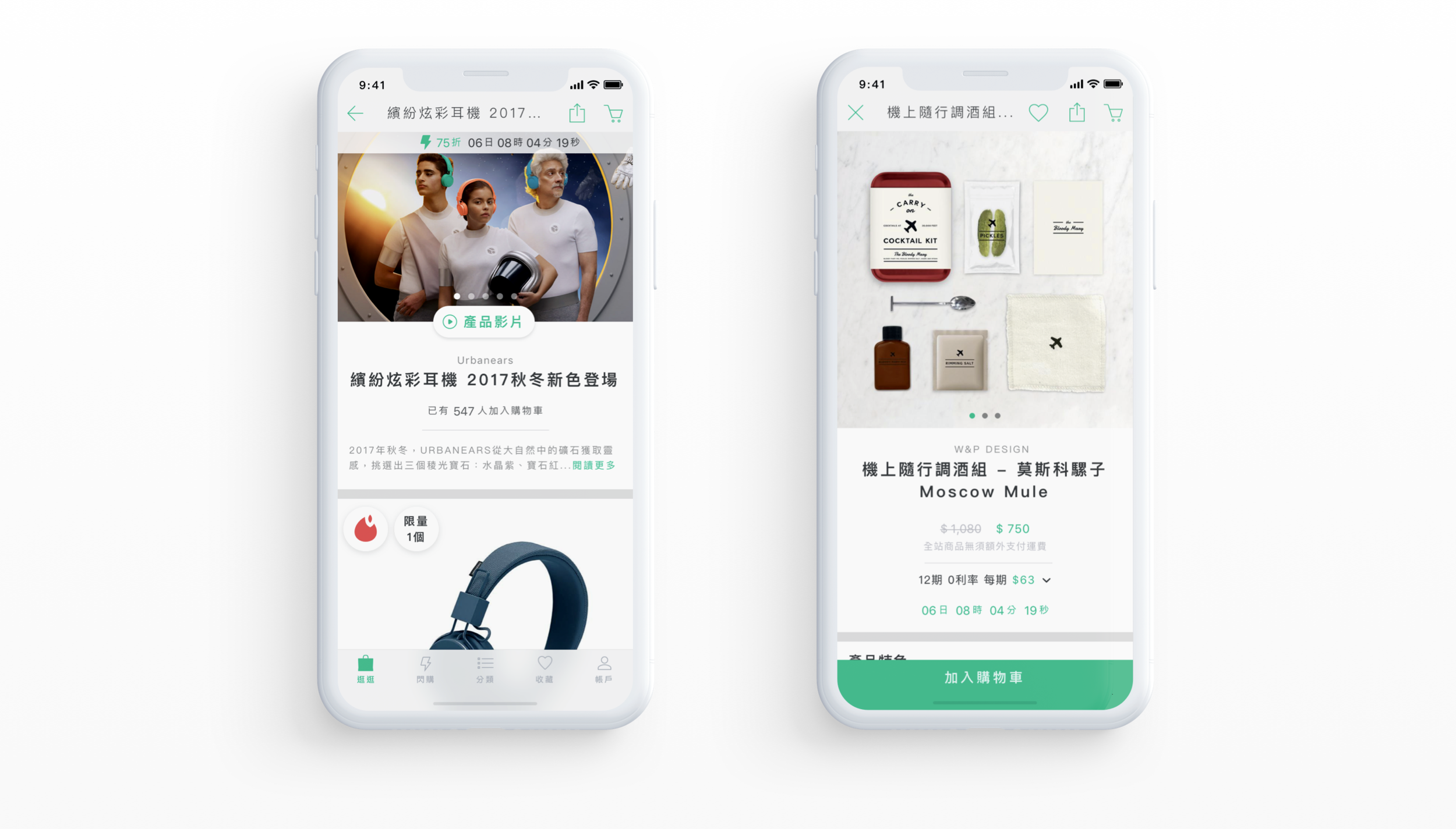
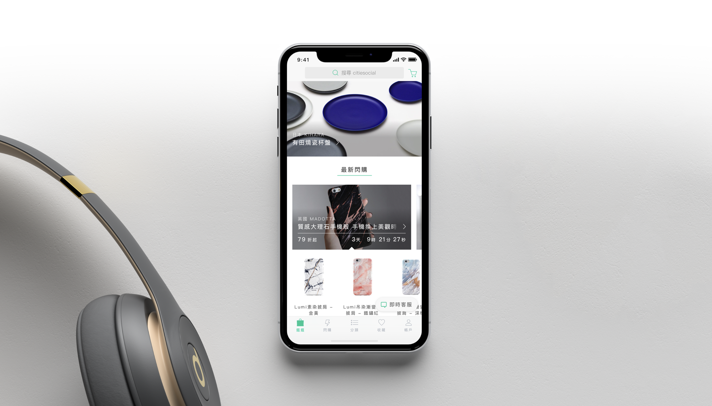
Clean experience for e-commerce
We focused on simplifying the interface to reduce cognitive load and help users shop with ease. By prioritising visual clarity, consistent layout, and thoughtful use of whitespace, we created a more intuitive experience. Key actions are easier to find, product information is more scannable, and the overall journey feels faster and more enjoyable.